


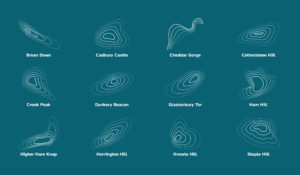
Topographics
We have developed a striking range of topographical-style graphics to work alongside our logo to reinforce our brand identity. Each graphic features a different landmark in Somerset. Some are better known than others but they represent the varied landscape for which the county is famous. Each graphic features five lines which reference the five previous councils coming together. Currently, there are 12 ‘topographics’ but we intend to add to these in the future.
These graphics bring depth and texture to our designs and all corners of Somerset are represented. The design team won’t be prescriptive about where they are used; for instance, Glastonbury Tor could be used for a campaign based in Minehead.
We are one county and proud of it.
The topography should be reserved for professional design use only. Please contact the design team if you need access to the vector files.
The topographic shape based on the logo outline (not shown below), should be reserved for corporate and high-use materials only, such as branded documents and ID badges.
Usage
Make sure you stick to the stroke width ratio set out in the design files. You can increase or reduce stroke width if needed, as long as all stroke widths are changed relative to each other.
The stroke widths should follow this ratio – from thickest stroke (highest point) to thinnest stroke (lowest point): 5pt, 4pt, 3pt, 2pt, 1pt
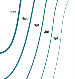
Make sure all topographics used in a material/design have matching stroke widths. For example; in a booklet, choose one stroke width and use it across all pages.
You can rotate and crop the topographics if you would like but do not reduce the number of lines, warp the shape in any way or change the order of stroke thickness.
Make sure to respect the colour usage and accessibility matrix when choosing which colour to use the topographics in. Generally, they should be used in, and placed on top of, one of the primary palette colours, but there may be opportunities to use other accessible colour pairings.
You can use tints on the topographics if you would like, as long as they respect the tint rules.
Make sure topographics do not intersect text.
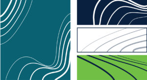
Topographics can be used in combination with imagery, by being placed on top of an image, or displayed as if it is weaving in and out of the elements in the image. The topographic should be added to the image or used to highlight an element and not distract.
Icons
Icons should be used to highlight and illustrate key information, whilst remaining clear, simple and informative.
Any icons used should match the brand style:
- Icons should be solid and bold – avoid using icons with thin stokes or no fill
- Icons should be displayed in a single colour which has clear contrast from the background
- Avoid using stylised icons, or clipart – icons should be clear and simple
![]()