

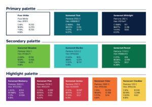
Colours
Use the Somerset Council colour palette and refer to the colour matric for accessible combinations.
Typography
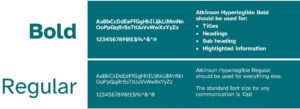
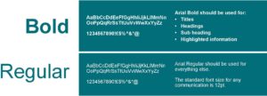
Atkinson Hyperlegible – for the design team, Arial for all other use. See the Foundations – Typography section for what we do on the web.
Atkinson Hyperlegible
Arial font
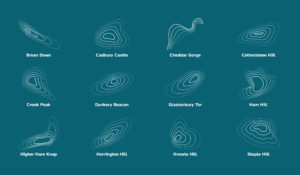
Visual devices
Use, and follow the guidance for approved ‘topographics’ in professionally designed materials.
Icons
Use icons that match the brand style.
Imagery
Use high-quality images which are positive and inclusive.
Tone of voice
Approachable and accessible using plain English with no jargon.
You can read further guidance on how we approach written content here.
Considerations
While it won’t always be possible or practical to incorporate all seven of the elements (for example, a Council Tax bill won’t include imagery) it is important that each element is considered during the design process.
Incorporating the seven pillars will make sure that our communication is consistent, recognisable, inclusive, and accessible.