Overview
To ensure consistency and reinforce recognition, the following colour palette should be used in core council communications and materials.
The palette is made up of three levels: the primary palette, the secondary palette and the highlight palette.
Primary palette
The primary colours are cool blues and white; these are the colours present in our logo and most easily associated with our brand. Colours from the primary palette should always be present.

- Pure White
Hex: #ffffff - Somerset Teal
Hex: #006072 - Somerset Midnight
Hex: #011e41
Secondary palette
The secondary colours are cool tones from the same side of the colour spectrum as the primary blues, which can be used to support the primary palette without contrasting too heavily.

- Somerset Meadow
Hex: #76bc21 - Somerset Marine
Hex: #19d3c5 - Somerset Forest
Hex: #006e43
Highlight palette
The highlight colours are punchy warm tones, which may be used to contrast against the cooler primary and secondary colours – these colours should be used sparingly to draw attention to a specific element or piece of information.

- Somerset Mulberry
Hex: #722282 - Somerset Pink
Hex: #9f2241 - Somerset Amber
Hex: #cf3339 - Somerset Cider
Hex: #ff6c0e - Somerset Cheddar
Hex: #f5ce3e
Colour balance
Colour coverage is determined by its level. Colours from the primary palette should aim to account for at least 65% coverage. If used, colours from the secondary palette should account for 25% coverage. If used, colours from the highlight palette should account for up to 10% coverage.

Tints
To increase the range, tints of all colours may be used. Tints should always be a multiple of 20 (100% / 80% / 60% / 40% / 20%).
Colours from the primary palette should always outweigh the use of tints.
Make sure to check the accessibility of tints against WCAG accessibility grades.
![]()
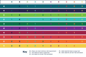
Colour accessibility matrix
The colour accessibility matrix compares all of the brand colours as a background contrasted to text. This determines the best colour combinations by checking how highly they rate on the Web Content Accessibility Guidelines (WCAG) accessibility grades. Use this chart to help you choose colour combinations which are accessible.
As an organisation, we aim for AAA rating where possible, but legally must meet at least AA rating.
This chart does not take tints into account. When pairing tints and text, please perform your own accessibility checks.

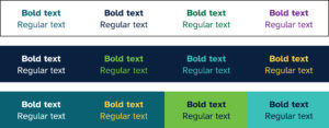
Common colour pairings
Below are examples of common colour pairings for text and backgrounds which meet accessibility standards.


