Overview
Five very different visual identities each with a heritage of their own, have played a huge role in creating the brand identity for the new Somerset Council. We recognised that the skills and vision lay within our authorities to deliver an exciting new brand for Somerset Council. The new logo has been achieved through a collaborative effort from our in-house graphic designers with input from a range of user groups.
Why the Dragon?
The dragon is deeply rooted in the history of Somerset and is regarded as an ancient symbol of great strength. The dragon holding a mace is heraldic imagery gifted to the County Council in 1911. Taking inspiration from our past but clearly looking to the future, the new logo featuring a modern dragon conveys that we are a new council, looking forward but not forgetting our heritage.
Why the five-sided shape?
In common with the dragon our five-sided shape purposefully faces forward to signify our direction of travel. The distinctive and recognisable shape tested well for accessibility and neatly contains the dragon. The five sides represent each of the former councils coming together as one.
Logo clear space
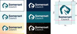
To give our logo room to breathe, it is important to maintain a minimum clear space surrounding it. This clear space isolates the logo from elements such as other logos, text, photographs, and printing edges.
The clear space is defined by the letter ‘S’ in both vertical and horizontal versions. Please use the height of the capital ‘S’ in Somerset as a minimum safe area around the logo.

Logo sizing
The landscape logo should be a minimum width of 120px in digital or 30mm in print.
The portrait logo should be a minimum height of 120px in digital or 20mm in print.

Logo placement
Our logo can be used landscape or vertically, choose the layout which is the best fit for the material. Please keep in mind the clear spacing when placing the logo. This keeps our logo placement simple and consistent while allowing enough space for text and other graphics.
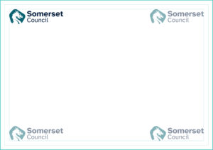
Whenever possible the logo should be placed at the top left of the page. Where the design does not permit this, the logo should be placed in any one of the other three corners.

Working with partners
Somerset Council as the lead organisation
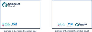
When working with partners as the lead organisation, the Somerset Council logo should be the most prominent. This would normally mean the Somerset Council logo is placed larger, at the top of materials, and the partner logos are placed smaller, as a group elsewhere, usually alphabetically. Partner logos should be placed along the bottom of a material, rather than the top.
For some resources, such as tri-folds, the logos can instead be placed on the back page.
When Somerset Council is the lead organisation, the materials should be designed using the Somerset Council branding.
Somerset Council as an equal partner
When working as an equal partner, all logos should be placed so that no logo is more prominent than any other. For example, this could be a strip of logos along the bottom of a poster. Unless agreed otherwise, partner logos will be displayed alphabetically.
When Somerset Council is an equal partner, the branding used could be that of a partnership, campaign or of Somerset Council. This should be agreed with the other partner organisations.
If you are unsure, please contact the Communications Team.

Logo usage
Use the full-colour version of the logo on white or very lightly coloured background colours or images. A colour filter can be applied to images to ensure accessibility.
Use the white version of the logo on darker contrasting background colours and images.
Use the logo files as provided, retaining form, text, composition and colour.


